Health on social

Since social media has been a big part of my internship search, I felt I really needed to start to learn who was doing it effectively. Below are some great findings.

Healthcare Influencer List

  • I had no idea that there were healthcare influencers! I’ve long been familiar with Johns Hopkins School of Public health, as it’s a top ranked MPH and med school. Here is there Twitter. It was actually a little different than I would think it would be. It was very informative, and personally being in the public health field I thought it was interesting. However, it was really only for public health professionals and those in the research world. It was very research heavy and even I had a hard time understanding their stand alone tweets. Its funny because this was one of the major reasons I passed on the MPH track. It’s all well and good to have interesting information, but if its not tied to strong intervention or communications, its effects are limited. However, I was really impressed with the CDC and APHA, but they have way less followers.

CDC Social media

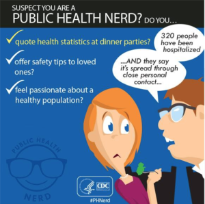
  • The CDC had individual accounts for each health aliment which can be found here.  I really liked the eHealth and Diabetes accounts. My favorite initiative is the “Public Health Nerd.”  A great post is “ Suspect you are a public health nerd?” Very Creative! It doesn’t seem to be well maintained, and some of these posts are from 2013. When I checked Twitter for the#phnerd hashtag, there is a little activity, but very rarely is it linked back to the CDC. However, I’m glad I found it because people do seem to be really excited about public health. Using the hashtag I found some interesting public health Twitter accounts and organizations. There was one especially interesting organization called Lucky Iron Fish.
Screen Shot 2016-04-28 at 5.46.29 PM


  • Also worth checking out is the CDC’s instagram. I was impressed to see they have 200,000 followers! However, some posts were awkward pictures of their campaigns. I was not feeling the below pictures. They are a  bit cheesy and it took away from the other amazing posts. My favorite was about a local Ebola Campaign. There was entirely too much text, but I liked the overall idea. Another great example was an up close and personal shot of bacteria. 

Screen Shot 2016-04-29 at 11.09.47 PM

Screen Shot 2016-04-29 at 11.09.25 PM

Special Note on the APHA

After doing all this social media research, I feel like the APHA deserves a special shout out. I can’t believe its taken me this long to blog about the organization. I went to the APHA conference in San Francisco a few years ago, and have been a huge fan ever since.  Its a non profit that works to connect public health professionals in the aim of improving health outcomes all over the world. Below is their simply and awesome Mission and Vision (below).

Our Mission- Improve the health of the public and achieve equity in health status.

Our Vision- Create the healthiest nation in one generation.


There are two major features on their website that really stick out. On their homepage are a list of webinars that anyone can attend. One particularly interesting one is found here.  You can even view past webinars. Here is one that addressed the Flint Water Crisis.  You can find out more about the APHA here.  The second feature that I thought was great was their Public Health Newswire. It collects all the latest health related news.


Zika

This has been the most attention getting and pathos-saturated Zika piece I have seen. It is a video by AJ+  It is a simple, low budget piece with clear, reasonable low grade level language to described a really sweet, likable mother learning how to care for her child while he suffers from effects related to the virus. Her challenges of caring for new baby are the same as anyone here in the U.S. Everyone just wants to be able to take care of and raise their children.

I feel like the producers of this video do a great job. It shows the audience that this mother is doing everything she can to balance her new responsibilities with her current ones.

This is excellent storytelling and could be used a model by other nonprofits. I like the light music and featured proactive mother just trying to do her best. Although it is obvious she is in a low-income housing development, I do like that they are trying to put a positive spin on this situation. I mean who doesn’t want to just give this mother a hug? I wish I could donate directly to her!

I found an interesting site called “Healthmap.org”  that tracks all outbreaks including Zika, which unfortunately shows it seems to be spreading. Since most of us in the U.S. live in highly populated cities, crisis protocols are of the utmost importance in dealing with an outbreak. Here is another excellent article on Zika and how structural issues keep families from getting the care they need. It reports how “telemedicine” and mobile treatment vehicles has been effective in helping those in need treat alignments. Below is one of the most powerful pictures I’ve seen to showcase the effects the virus has had on infants.


Screen Shot 2016-04-13 at 4.45.25 PM


Diagnoses Relief

Last week I posted about the Ad Council’ autism awareness campaign. I snooped around a bit more and found an NPR article to back up much of what I posted last week. Below is a great article about three individuals  journey to an autism diagnoses. The one that stuck out the most was Sam Harvey (below). I hate to give it away, but he was able to navigate the school system and become a teacher before finding out he even had a social disorder. This proves that for many integration into the school system at a young age has proven benefits.

As an aside, I love the graphics they used to portray each of the featured individuals. They are portrayed in positive light, as if they were a famous, contemplative author or musician. I think this is a wonderful way to portray those who have difficult stories to share.

Pieces like this can really work to decrease stigma of those with disabilities. Imagine if a teacher shared these stories with a class in middle school?


Screen Shot 2016-04-03 at 12.12.10 PM

Ad Council FTW

My absolute favorite campaign right now is the Ad Council’s Autism Awareness ( ad featured below). Here is a great video that seems like it could be appropriate not just for families learning how to handle an autism diagnoses but also for young students. This would help children develop more empathy and understanding towards those with developmental disabilities. I have volunteered with Easter Seals and truly believe in its evidence based programs. Here is some interesting info. on services for children while attending school. My favorite part of the organization was learning how having an inclusive school environment helps those with disabilities progress faster and helps those without learn to be empathetic and sensitive at an extremely young age = win-win.


IMG_7254

Most importantly, here is an interesting a report that says financial and economic status plays a role in increasing chances of autism, as a mother’s health can effect rates. You can find the study on autism here. Just another example of how your environment can determine your health.


“Selling” Health

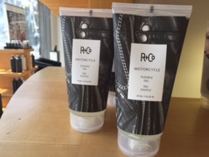
When I was home for spring break getting my hair cut and I saw some attention getting packaging that caught my eye.

These were done by R and Co  and its obvious that they are soaked in customer insights.  In reality what does a well done manicure or a leather jacket have to do with hair spray? Absolutely nothing. And it doesn’t really matter. What matters is that I knew I liked it and it stood out from the other products. This made me wonder if any health products were trying out similar tactics.

IMG_7462


IMG_7454

 IMG_7460


When I looked to see if there similar techniques in packaging. I quickly was able to find a fair around. Below are some examples of a creative food, acne medicine and meal packaging.


creative-packaging-part3-1
Bored Panda – Fit Buns
creative-packaging-part3-14-2
Bored Panda – Clearasil Acne txt


284251_2_800
Emotive Food packaging article

This is my favorite packing item. As soon as I saw it I could imagine myself grocery shopping in NYC and seeing this, feeling home sick, buying it and sending a pic to my mom. I love that you can see the actual products and the drawings are creative without being too much. Its limit on colors, and white packaging help create a simple, crisp look that seem to be a good choice and properly reflect the values of a produce company.


Focusing on Ability in NYC

I have never been on a campus that has been so accommodating to individuals with disabilities. My higher education experience has not been extensive, but I have spent a fair amount of time in a small town in central VA and private university in DC for undergraduate and graduate coursework. My first hand account of Columbia incredible. Right way I noticed several students in wheelchairs. The school does an excellent job of placing ramps to every lecture hall and anywhere there is uneven terrain. I can’t help but feel very proud and lucky to be apart of a system that supports everyone. It truly keeps the school and city for everyone who wants to be here, and showing it is possible to have a space for all.

IMG_7205 IMG_7209


This seems to extend past Columbia, as well. All around NYC I see blind individuals taking the subway alone and restaurants with similar accommodations (below).

IMG_7204

Subway Signage gets an A +

According to the MTA, 4.5 million people use the subway every day. This is astonishing as the population of NYC is estimated to be around 9 million. This means there is high reliance on the subway, but also it serves as an excellent medium to communicate with a large number of people.

Personally I feel MTA does a great job. The figures are simple and clear. Riders aren’t distracted by the messenger as they use colorful cartoon figures. Having this an option to communicate to such a large number of people is vital to public health professionals the ability to disseminate information to people quickly.          

                    IMG_7491


Here are a few more examples. You can see its well designed, has simple messaging. Even though the figures can be understood to people with varying English proficiency, these signs are great because they include multiple languages when they include additional information. The hoverboard example is a personal favorite.

IMG_7331 IMG_7338


John Oliver says ixnay on the “cray cray”

I don’t know anyone who doesn’t love John Oliver. He is the ultimate story teller and oneof my favorite New Yorkers .Here he covers how mental health is portrayed in the media. He uses excellent visuals and evidence to support all of this claims.  His sources are fantastic as he is citing studies from Health and Human Services which can be considered reputable government studies.  A good thing to remind ourselves is health is much broader than physical health, mental health is just as important. One thing my mom once said once to me is if you don’t have your mental health, you don’t have anything. It truly is the great equalizer.  

He states 43.8 million adults in the US have mental health struggles, and 10 million have more serious and advanced issues.   He shows the headlines of the studies with short verbatim quotes from each piece. This is an excellent way to report on health studies, but also a great way to frame mental health.  There is too much stigma surrounding mental health, particularly if according to these numbers, 13% of the US population may suffer from it. Additionally, instead of just saying its a serious problem, he also works to remove stigma from those who suffer.

Here is SAMSHA’s direct site to get more information on various mental health issues or to find information on treatment options.

Zipcodes and why they matter

A perfect example of social determinants of health is highlighted in the idea that life expectancy can vary by zipcode. This article succinctly describes why life expectancy can depend so much on area of residence. It highlights an almost 20 year difference in New Orleans from one zipcode to the next. This reviews all of the social elements that work together to contribute to either higher or lower life expectancies and is truly one of the best ways to understanding social determinants of health.