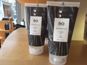
When I was home for spring break getting my hair cut and I saw some attention getting packaging that caught my eye.
These were done by R and Co and its obvious that they are soaked in customer insights. In reality what does a well done manicure or a leather jacket have to do with hair spray? Absolutely nothing. And it doesn’t really matter. What matters is that I knew I liked it and it stood out from the other products. This made me wonder if any health products were trying out similar tactics.


When I looked to see if there similar techniques in packaging. I quickly was able to find a fair around. Below are some examples of a creative food, acne medicine and meal packaging.


This is my favorite packing item. As soon as I saw it I could imagine myself grocery shopping in NYC and seeing this, feeling home sick, buying it and sending a pic to my mom. I love that you can see the actual products and the drawings are creative without being too much. Its limit on colors, and white packaging help create a simple, crisp look that seem to be a good choice and properly reflect the values of a produce company.