Just some good old advertising

Since I’ve been posting a fair amount about public health campaigns, I figured I would see if there were any commercial campaigns that were targeting healthy behaviors, but through a marketers eyes. Here are some other campaigns that I thought had a creative twist from  Trendhunter.

173570_1_800

193491_1_800

I also enjoyed this World Health Day campaign. This is classified as a public health campaign, since the desired end result is improved health outcomes and behavior change

.Screen Shot 2016-03-20 at 6.09.19 PM

“Selling” Health

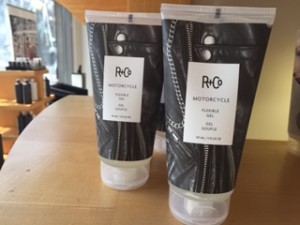
When I was home for spring break getting my hair cut and I saw some attention getting packaging that caught my eye.

These were done by R and Co  and its obvious that they are soaked in customer insights.  In reality what does a well done manicure or a leather jacket have to do with hair spray? Absolutely nothing. And it doesn’t really matter. What matters is that I knew I liked it and it stood out from the other products. This made me wonder if any health products were trying out similar tactics.

IMG_7462


IMG_7454

 IMG_7460


When I looked to see if there similar techniques in packaging. I quickly was able to find a fair around. Below are some examples of a creative food, acne medicine and meal packaging.


creative-packaging-part3-1
Bored Panda – Fit Buns
creative-packaging-part3-14-2
Bored Panda – Clearasil Acne txt


284251_2_800
Emotive Food packaging article

This is my favorite packing item. As soon as I saw it I could imagine myself grocery shopping in NYC and seeing this, feeling home sick, buying it and sending a pic to my mom. I love that you can see the actual products and the drawings are creative without being too much. Its limit on colors, and white packaging help create a simple, crisp look that seem to be a good choice and properly reflect the values of a produce company.


NYC’s synthetic MJ public health problem

In a class last semester, we did an observational assignment on the subway to report on rider behaviors. We then used this information to make a recommendation to a fictional client. The subway assignment showed this is a concrete way to reach people. Since people are literally stuffed to the brim on the train, people are fairly often looking around.  In our assignment we were able to indemnify a particularly distinct segment. We proposed to tart middle school age children for either healthy eating or possibly anti bullying campaign. We noticed around 3 they often travel together, engaged in conversation with peers and often still have high energy compared to the other riders.


Below is a subway public advertisement that caught my eye and I thought would potentially be targeted for high school students. Most people, including myself before reading this, don’t know why synthetic marijuana is so dangerous. Here is a Forbes article explaining how it is very different than regular marijuana. I was surprised to see public health officials fear tactics, which tend to have mixed results in effectiveness, but this article states there reports of the average ages of users is 26. It goes on to explain why De Blasio has recently banned these products. The article states users assume its safe and similar enough to natural marijuana, but there have sharp spike in ER visits and 15 deaths in the first half of 2015. The severity and misconception of the drug may warrant a harsher, scare tactic if the campaign is trying to get the word out ASAP. It definately got my attention right away.


IMG_7292

Subway Signage gets an A +

According to the MTA, 4.5 million people use the subway every day. This is astonishing as the population of NYC is estimated to be around 9 million. This means there is high reliance on the subway, but also it serves as an excellent medium to communicate with a large number of people.

Personally I feel MTA does a great job. The figures are simple and clear. Riders aren’t distracted by the messenger as they use colorful cartoon figures. Having this an option to communicate to such a large number of people is vital to public health professionals the ability to disseminate information to people quickly.          

                    IMG_7491


Here are a few more examples. You can see its well designed, has simple messaging. Even though the figures can be understood to people with varying English proficiency, these signs are great because they include multiple languages when they include additional information. The hoverboard example is a personal favorite.

IMG_7331 IMG_7338


Time and Weightymatters get it right

Readers should always be skeptical of health studies. It seems like every time I open any news outlet there there is a new finding. Like high fat is good for you, coffee is bad for you.  One of my professors has said when reading about data findings, always see who is publishing or funding the study and what the motivation may be behind the findings. In this post I wanted to highlight two studies that are on opposite sides of the spectrum.

Time does an excellent job of reporting on and discussing a recent study on Diet Coke. Not only do they say the number of people and the ages, they also include excellent background information. They include multiple studies to reinforce the first study. Additionally, they give tips on how to cut back on soda, and help provide context. They lists the severe consequences to weight gain that it is beyond just cosmetic reasons. Also, it includes biologically what happens to to body after ingesting soda and the complicated relationship you can have with these “fake”healthy options.

I think the worst part is that this is particularly harmful to those over 60, who are not only likely to be dealing with age related alignments, a decreasing metabolism, leaving them even more vulnerable. Particularly that people may be trying to make better decisions with low calorie options, but in the long run setting themselves up for failure.

In contrast, here is another beverage study about Welch’s grapefruit juice in a blog post by Weighty Matters. The sample size is 25, of 19 are mothers who work. This sample size is not only too small but they are most likely using a demographic that they are attempting to market. My professor says for market research a study should be at least 100, at the minimum. Here are some guidelines I found on Health study sample sizes. Additionally the Calorie Control Council has an incredibly deceiving name. It sounds like its a health or diet task force, but no, it is a lobby for low calorie drinks.

The author does an excellent critique of the study which of 25 participants who begin to drink grape juice for 12 months. From this limited sample, they made a huge leap stating that he took verbatim from a press release, “New research by the University of Leeds in the UK suggests that drinking Concord grape juice daily can benefit certain aspects of memory and everyday tasks in people with stressful lifestyles – specifically working mothers.”

The company closes out by including Welch’s history and that it has been around for 150 years. Not only is this a plug, but its trying to establish credibility from the fact its been around for a while. None of this is relevant to the presented information. The upside is if companies do present information like this, its easier to spot illegitimate studies.

There is nothing wrong with drinking Diet Coke or Welch’s but the discussion needs to be re-framed, and these drinks should be considered a treat, or used for special occasions. People should not be lead to believe if they began to drink diet coke, or grape juice that they are it is in some way, “ beneficial” as this article states the company claims. I do believe there should be room for these products on the counter, however, there should be better marketing guidelines on how products are marketed, especially when produced in tandem with health studies.


Isle Health

Here is an excellent podcast that highly resonates with me as I love the idea of using traditional marketing techniques for good. Here research on shopping behavior is used to influence buyers’ decisions while shopping. Examples include where to place products, use of descriptive words over generic, pairing frozen meals with frozen veggies, effective use of lighting, and signage techniques. This article has always stuck with me as it is one of the main reasons behind foregoing a masters degree in public health. If you can’t beat them, join them. From previous coursework, it seemed like marketing always had the latest and greatest information. It seemed the best route to making the most difference.


My favorite part of this article is that this is simply a common sense approach. Both customer and grocer benefit. 
IMG_7110


I wanted to highlight this because this is something I see constantly in New York City. As both big chains (above) and small groceries (below) are doing this, whether it is intentional or not. I can’t think of a better use of space or better place than NYC to use this technique.  Just another reason why city living can be surprisingly healthful.

IMG_7077

#marketing#produce#lightscameraaction#NYC